When it comes to web design, most people can’t tell you what all makes a good experience, but they can tell you exactly what makes for a bad one. Some errors are so glaring and so damaging to a website that they’re practically sins. Below are six sins of web design and how to fix them.
Have you ever visited a site and couldn’t figure out where to click to navigate through its pages? Sites lose about 50 percent of sales because the user can't figure out where to click to get the information they need. Even worse? Forty percent won't return because they’re frustrated.
You might have bad navigation if:
Bad navigation can turn site visitors off and tamper with your conversion rates.
How to fix:
You can fix bad navigation by thinking through how other sites are typically set up. Users expect the navigation to be across the top or on the left side near the top. They also expect links along the bottom of the footer. Choose some main categories and offer a site map or a drop down menu for larger sites.
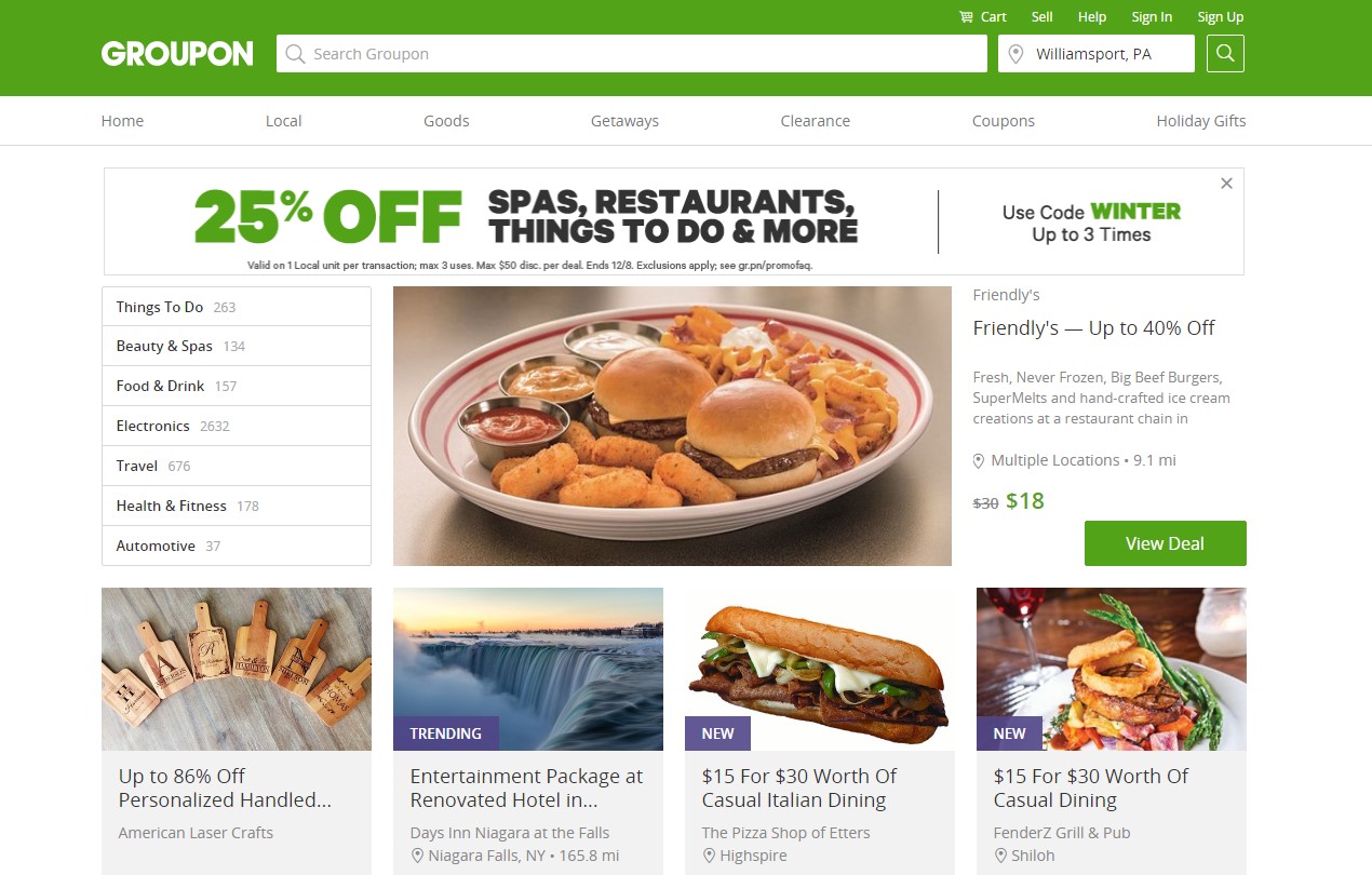
You can see an example of good navigation on the shopping site Groupon. Groupon has navigation tabs at the top of the page and then additional categories that further break them down along the left side bar. Click on any page and the navigation is still clearly visible. Users can easily find the shopping cart at the top of the page with a cart icon.
If the fonts on a site are too small, the text will be difficult to read. You have an average of 8 seconds to grab someone's attention and get them to read the content on your site. If your font is small, the reader may grow frustrated and leave. Some mistakes with tiny fonts include:
A tiny font is particularly hard for anyone with a vision impairment to read. This can include anything from needing bifocals to being color-blind.
How to fix:
Fortunately, this is a very easy fix.
Consider the overall balance between the size of the text and the images on the page. Smashing Magazines recommends using at least a 16 pixels for the right line height. Stick with common fonts, such as Arial or Times New Roman, so that you know what size to expect.

A good example of a site with good font size is Engadget. Notice how the majority of the text is in a larger font size that balances nicely with the height of the images.
Trying to pack too much information on a page is very distracting to the user. Some of the other elements mentioned in this list can exacerbate this problem. For example, if you’re using the wrong line height for text, then you might have a tiny font that allows you to add too much information and make the page crowded.
Large sites also have this issue at times, as they try to let visitors know about everything they have to offer on one page. However, it is much better to keep the overall design simple.
How to fix:
A simple design means that the content you display on your landing page is limited to only the most important information.

A prime example of a simple and beautiful design is CJ Pony Parts. This site keeps it simple by featuring the main categories in capsules. This creates the perfect cohesive look with a line height for the titles that matches the size of the capsule images. Call to action buttons complete the effect and keep the focus on exploring the content further.
Websites are a very visual medium, which means that you have to actually be able to read them and view them. One deadly sin of website design is using poor typography. This can include:
One example of this would be a site that uses light text on a light background, such as white on light pink.
How to fix:
If you fix only one thing on your website, fix the contrast between the background and the text. If the background is dark, the text should be light. If your background is white, the text should be dark.

An example of a design featuring a strong contrast between the text and the background is the site for the Ben Stiller movie While We’re Young. Even though the site uses yellow in the design, which would normally be a no-no, they do it by placing it over a dark background and providing the text as a cutout that shows the dark background through a transparent yellow capsule. Brilliant!
If you overwhelm your visitor by placing ads everywhere, then your bounce rate will likely be high, and visitors won’t return. A site with too many ads might do these things:
Remember that visitors want to gain information and that’s why they’re visiting your site. They can see ads anywhere.
How to fix:
There are some rules you should follow to make sure you aren't overwhelming your visitors with advertising.

A site that has ads but doesn’t overuse them is Restless Chipotle. The focus of this site is on recipes, images of the food, and info on cooking. However, the site does utilize a few ads near the bottom of the page and on some of the recipe pages. It isn’t overwhelming and the focus is where it should be, on the content.
When using audio and video elements in your design, be sure to include a way for people to disable them. Some people do not have fast internet connections or may access your site at work, where they don’t want loud music to suddenly start playing.
Avoid:
Video and audio might seem like a great thing to put in your designs, but society still isn’t at a point where everyone will appreciate it.
How to fix:
So, how can you utilize video and audio without sinning against design? Offer the user an option to view the video or audio, rather than have it autoplay. Additionally, ensure that there are clearways to exit once the video or audio starts to play.

A good rule of thumb to live by when it comes to audio and video is asking, “Can I better explain the same thing with written content?” If so, then don’t add it. An example of a site that uses audio and video well is YouTube. Although a video may start to play upon landing on the site, there are clear markers on how you can stop it, restart it, pause and move elsewhere. You can take a cue from YouTube and easily incorporate these details into your own design.
When it comes to web design, new trends make their way into the industry every year. While some of them are exciting, not all are beneficial to site visitors. Be vigilant about avoiding design sins and your clients will thank you.

Lexie Lu is a freelance UX designer and blogger. She keeps up with the latest web design trends and always has a cup in close proximity.
Get started with everything you need to know about developing a website.

Look at what a difference a website redesign makes!
 Before
  After
After - Before and After - jvmovers.com

In 2022, we completed our transition to Advanté-BCS. Our team provides the same high-quality service that our clients have come to enjoy under a new brand.
Please visit us at https://advantebcs.com/website-design/ to get started with your new website!